|
|
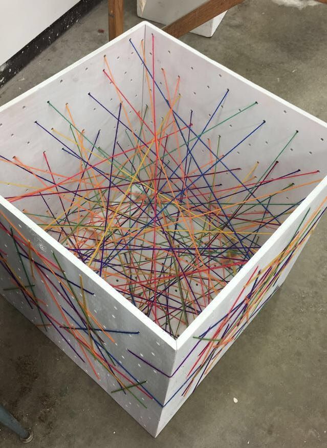
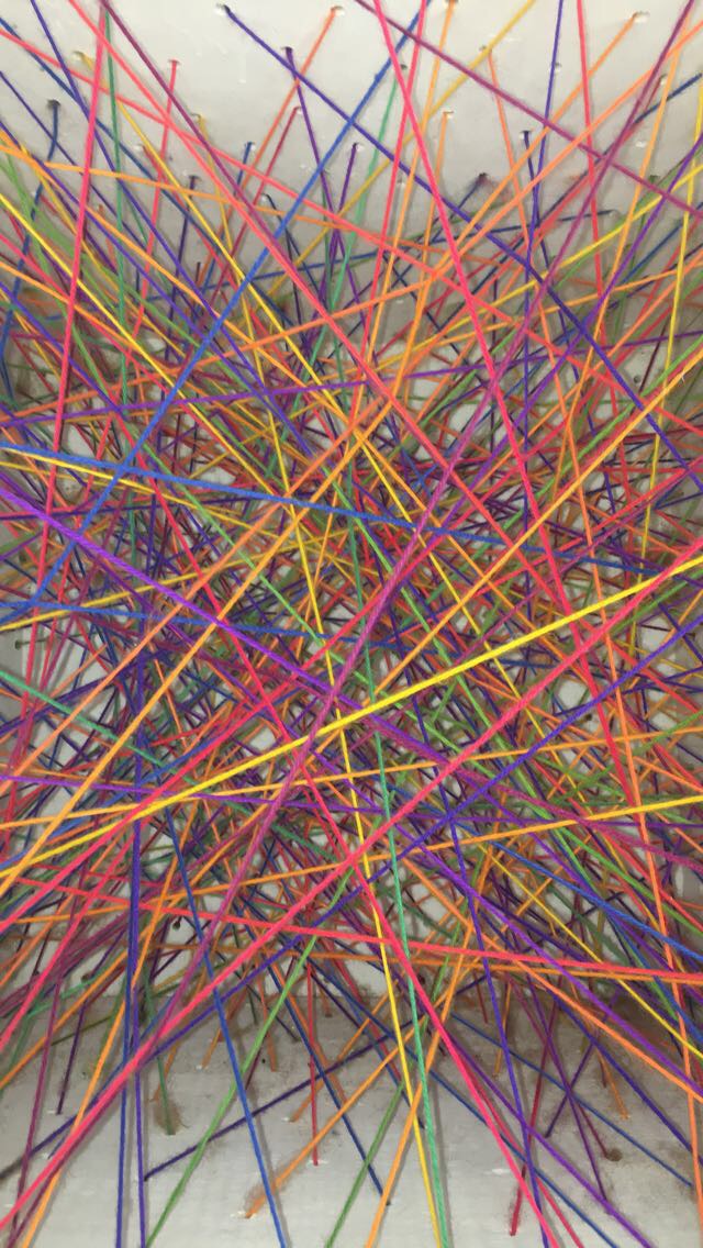
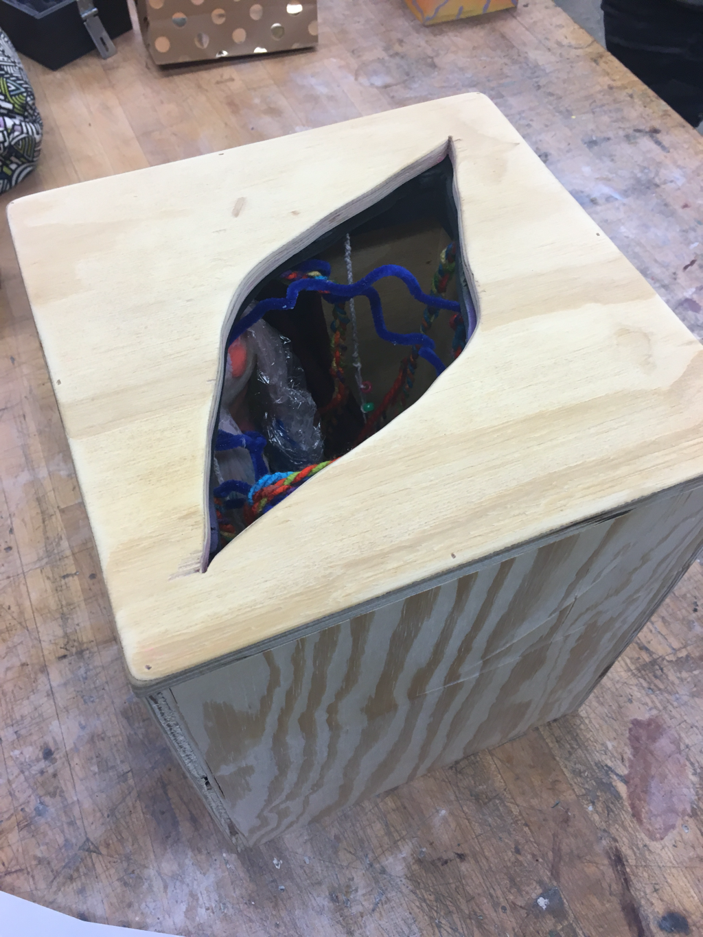
For the second half of the semester, I chose a different route. I made two cubes with one side missing, drilled holes in the sides, then ran colourful yarn through the holes to create a sculptural drawing within the cube and on the outside of it. I wanted to use rainbow yarn because my work in other classes always features a large variety of colour. I made a white box because I wanted to see the colour interactions and layers without the distraction of another colour. I am very happy with the final product. I think the box is fun to look at and the lines on the outside of the box are interesting to explore. I carefully chose where each colour would go and which colour they would layer on top of. I take a lot of colour theory into consideration and layer complements over each other as well as exploring other colour interactions. I believe this piece is successful and I look forward to completing the black box and boxes of some other colours. I am hoping to use these pieces in my BFA show next semester and I want to make 3 grey-scale boxes to go with this series. I am also thinking about painting some smaller boxes different colours and experimenting with other colours of yarn. I am very happy with the sculptures I have made throughout the semester and am very excited to see where they take me.
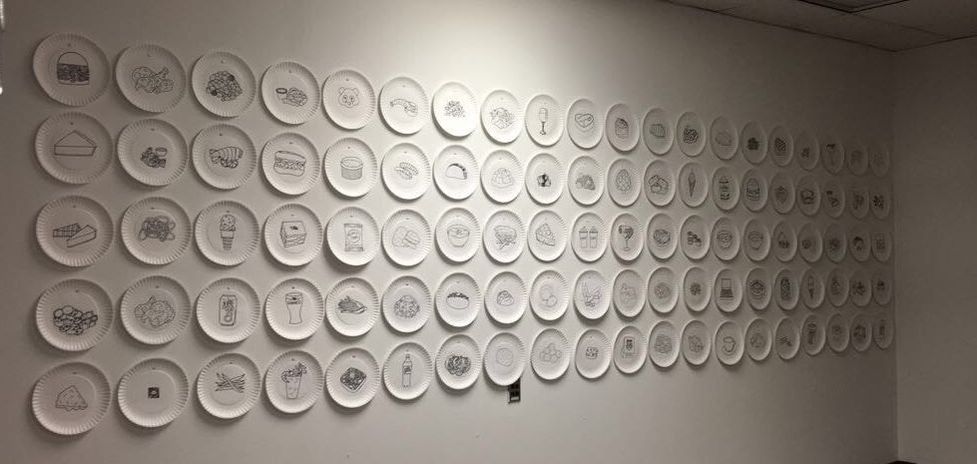
100 Item installation
|
|
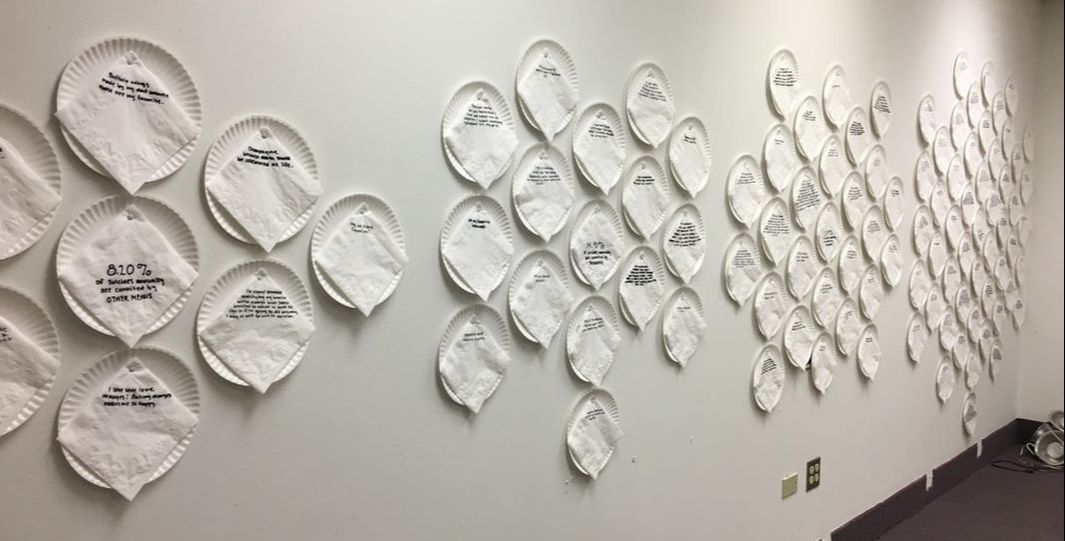
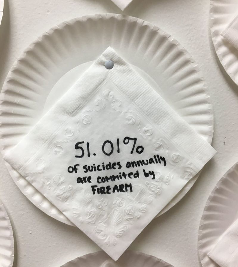
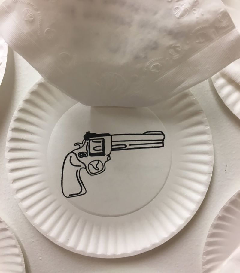
For the third and final part of my installation, I added four plates and napkins and I rearranged the plates into a more interesting composition. To make the viewer think more, I added plates for the three most common methods of suicide used annually in the US and one more plate for all other methods. Since I was using percentages of methods, I was able to arrange the number of plates corresponding with each method around the plate with the method of suicide on it. Another thing I hoped to get across in this installation was the high percentage of people who commit suicide with firearms each year. Over 50% of suicides are completed with guns, which are a huge issue in our country right now and hopefully my piece got a few people thinking about how easy it is for people to get their hands on a gun. The fact that my project is now based on suicide makes the installation a little more uncomfortable because it's not something many people talk about openly. This is why I placed the method plates in the center, because they're not very obvious until you investigate the other plates and look closer at the composition. Suicide is something that effects so many people around the world each year and I believe art can help start the conversation about it.
|
|
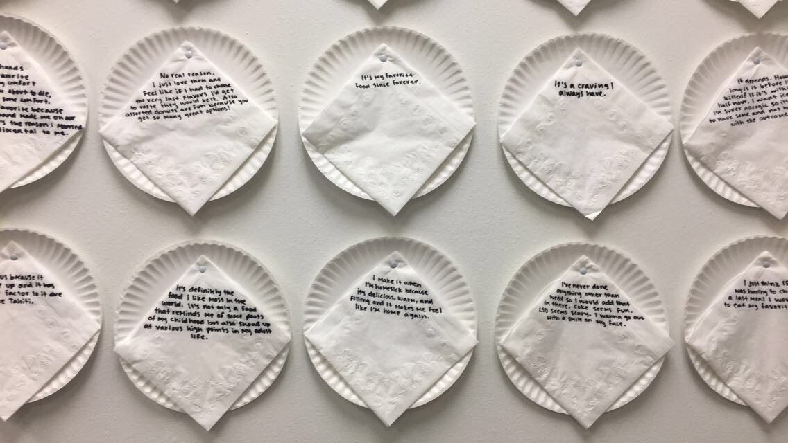
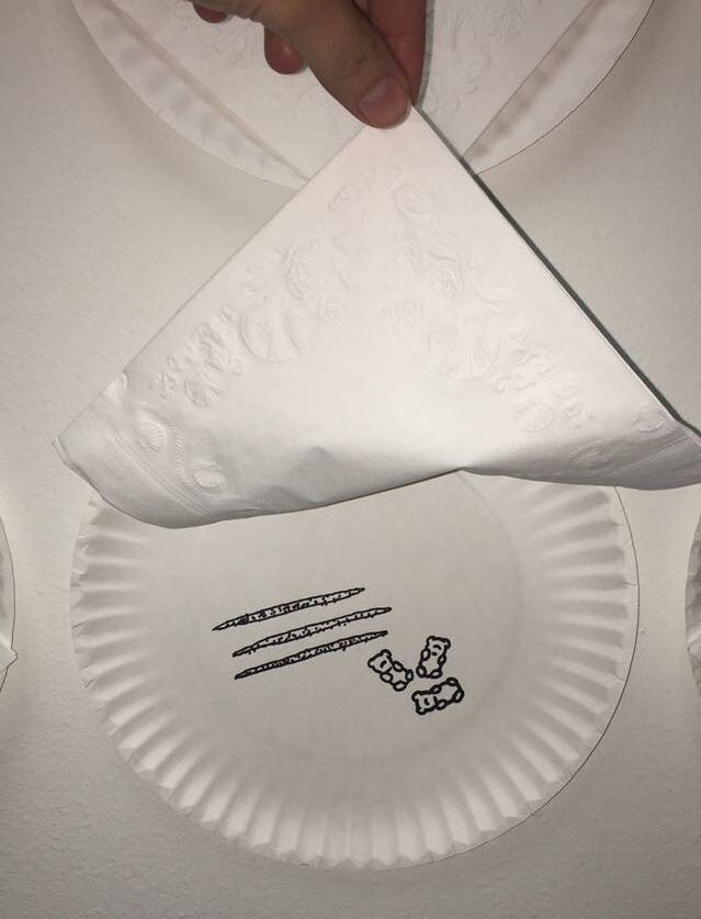
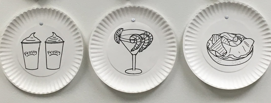
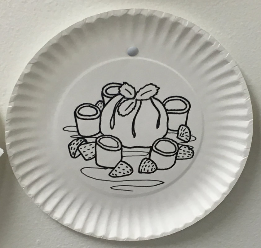
For part two of my installation, I added napkins to each plate. On each napkin, I wrote the reason for the person choosing each last meal. Some of the reasons explained that it was a last meal, but some were just the reason they love the meal. 22 of the original 100 I asked did not get back to me with their reason, so I had to draw 22 more plates and write all 100 reasons. I used Sharpie to write the reasons so they would correlate with the plates. I put the napkins on top of the plates draped over the drawings of food so the viewer can read the reason then lift the napkin to reveal what the food is. The reasons over the plates definitely helped get my concept across better and had the viewers wondering about what they would choose as their last meal, which is what I was hoping for.
|
|
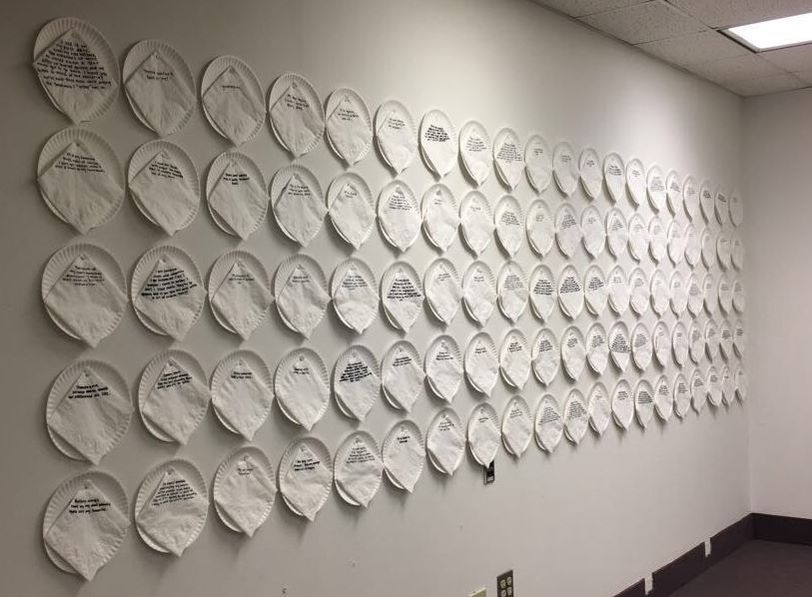
For the first part of my installation project, I had to use 100 objects. I asked 100 different people what they would choose as their last meal if they knew they were going to die. After I got enough responses, I drew each of the last meals on a paper plate with Sharpies. I used a paper plate because they are disposable, just like people and our lives are. I decided to hang them on the wall in 5 rows of 20 because I thought it would look nice. A lot of people enjoyed my installation and thought it was fun, but I didn't get my concept across at all. For the next part of my installation, I hope to somehow convey the "last meal" aspect of it and make the viewer question what they might choose as their last meal. I am also thinking about adding colour to the pieces, but I'm not very confident in that idea.
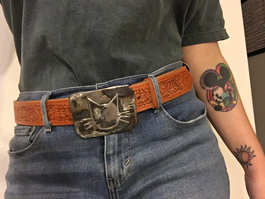
Belt buckle and case
|
|
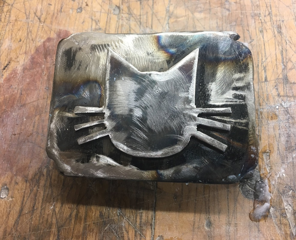
I enjoyed working on this project a lot. Once I figured out my idea, I became really excited about finishing my belt buckle and case. My project is a comment on gender identity. The outside of the box is very natural and inside it is pink because I wanted it to seem somewhat feminine at first. The box inside are the colours of the nonbinary identity. This is to show that whatever may be on the outside, there may be something different underneath and that it usually something you have to dig a little deeper for (or remove the outer layer). I glued different materials to the bottom of the inner lid. I wanted it to feel weird and a little unnerving when people stick their hand inside to get to the belt buckle. There are many different textures inside, including weird squishy stuff that I made. I put a few bags of the squishy stuff in the bottom of the case as well so people can feel that. I liked the way my belt buckle turned out. The colour and lines made by the various tools I used look really nice and I didn't want to change them. I didn't want the back to look perfectly smooth, so I didn't grind it down all the way. I left some texture and some empty space in the back just because I like things that are imperfect.
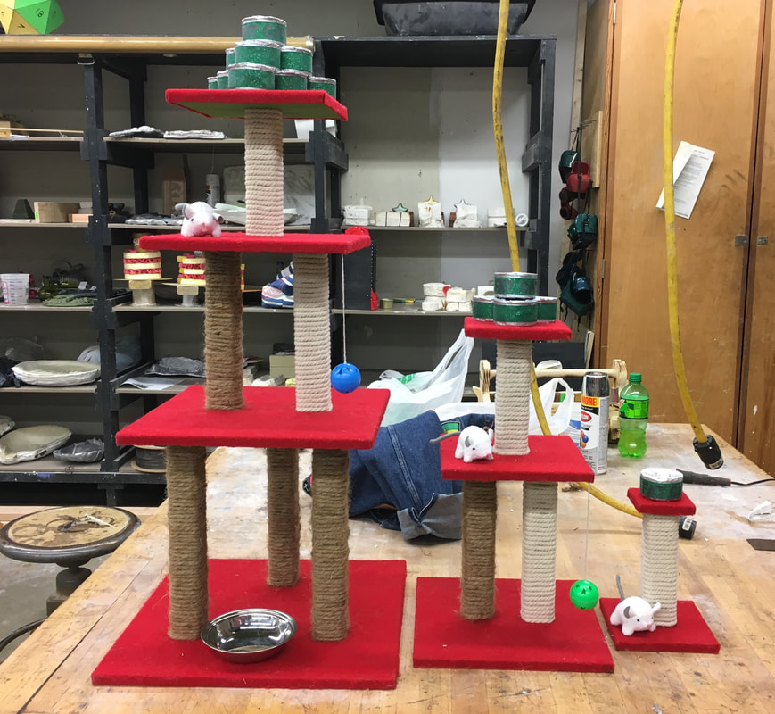
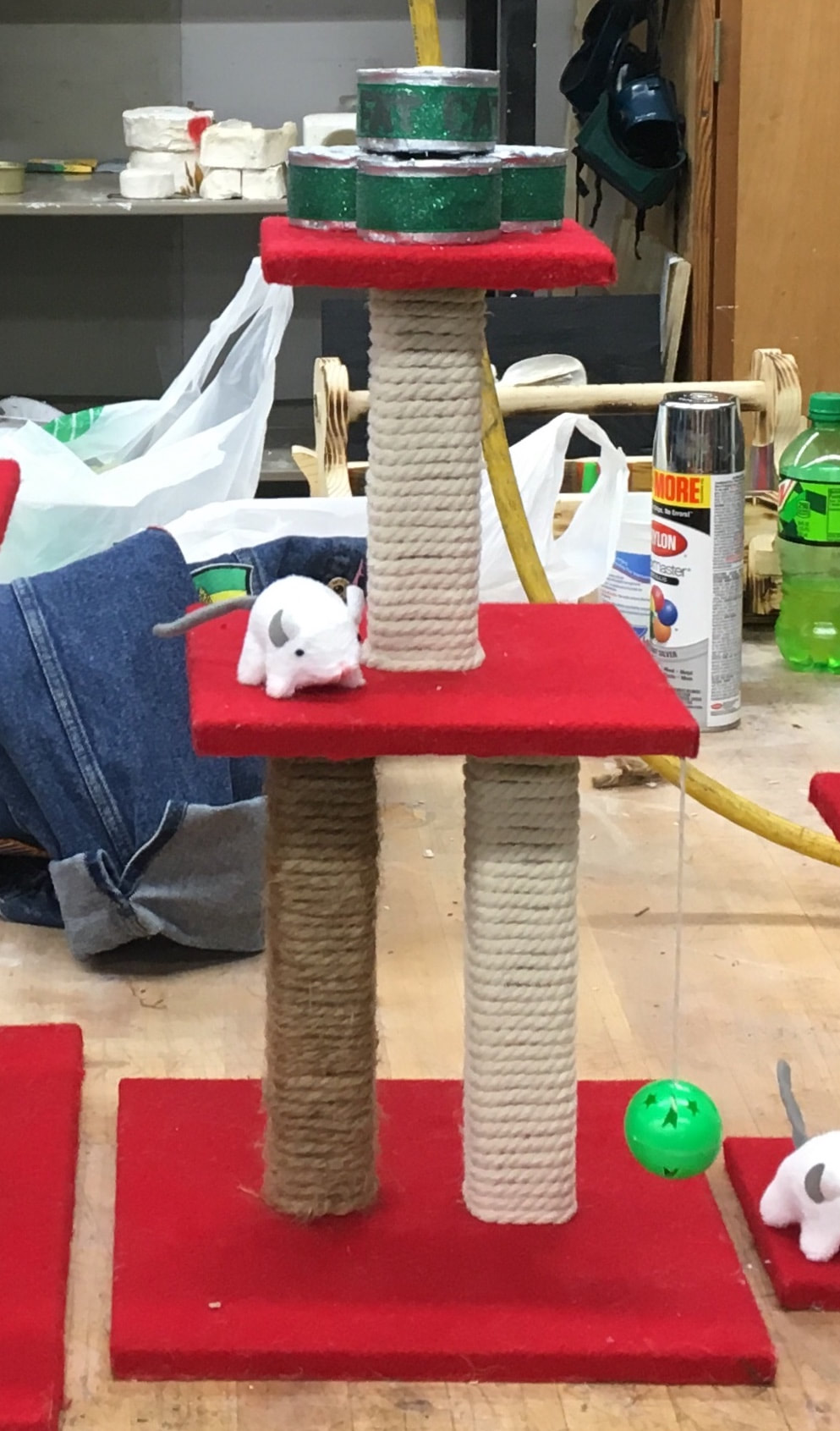
THE FAT CAT AWARDS TROPHIES
|
|
FAT CAT AWARDS - FIRST PLACE - ZIGGY STARDUST
FAT CAT AWARDS - SECOND PLACE - SYDD WILDIN' INANA
FAT CAT AWARDS - THIRD PLACE - PIPER STORMBORN
My trophies are made of plywood, beading cord, wax, crayons, clay, ribbon, felt, and cat toys. The base of the first place trophy is 15.5" x 15.5" and it is 30" tall. The second place trophy has a base of 10.5" x 10.5" and is 18" tall. The third place trophy has a base of 5.5" x 5.5" and is 9" tall. I really enjoyed doing this project, although I think I would be happier with it if Michael's hadn't run out of the cord I used. My idea for the trophies was to do the Fat Cat Awards. My cats are both pretty fat and they get so excited when I bring food out to them, I had to make them some awards. My plan was to make the trophies resemble cat trees or scratching posts then have the casts of a cat food can on top. I think it turned out really well aside from the off coloured cord around the legs of the trophies. After I got the hang of using the wax and my plaster mold, I really enjoyed making them. Having two molds helped speed up the process a lot. I used three different materials for the casts on each trophy. The casts on the first place trophy are made of wax because there was a pretty good supply of that and I had to make 10 casts for the top of that trophy. The casts on the second place trophy are made of silver crayons. I was planning on making all of my casts with melted silver crayons, but after melting 48 crayons I only had enough to make 4, maybe 5 molds. I only needed 4 for the top of the second place trophy so I decided to use the crayon casts for that one. Since I used different materials on each of the first two trophies, I decided to use a third material for the last trophy. The cast on top of the third place trophy is made of clay. I spray painted all of the casts silver (yes, I totally wasted money on those silver crayons) and wrapped green ribbon around each to make it look like they each have a label. I didn't want to add a plaque because I want the trophies to look playful, so I wrote "FAT CAT" on the "label" of the top can on each trophy. I believe my project was successful because all of my friends that saw me working on these trophies asked if I was making a cat tree for my cats, Ziggy and Piper. Plus, Ziggy fell asleep on one already, so I have the approval of the first place winner of the Fat Cat Awards!
Self Portrait toolbox
|
|
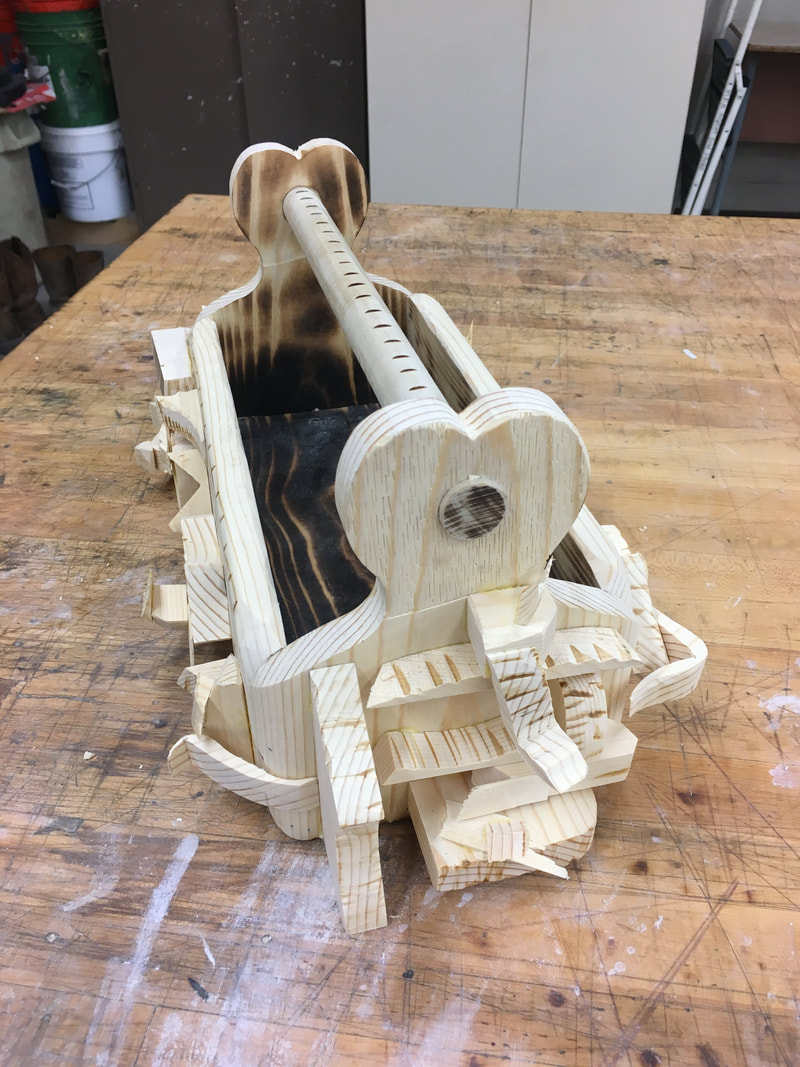
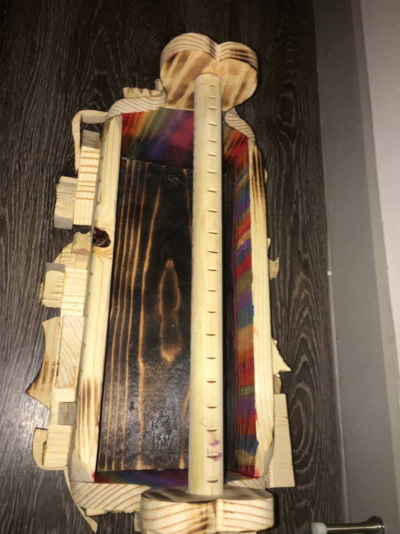
My toolbox is 20” long, 11.5” wide, and 9” tall. The materials I used were wood, nails, and acrylic paint.
I wanted to make this toolbox in a simple manner, the way my dad taught me to build things when I work with him. I assembled my toolbox just using wood glue and a nail gun. The exterior of my toolbox deals with my body image issues. I cut and burned the outside to create more flaws on it, like the flaws I see in myself. After I finished doing that, I glued scraps of wood onto the sides. I wanted to build the wood outward because I have body dysmorphia and almost every time I look at myself I look different, but still very imperfect. I know I see something different than what other people see, so when we were asked to make a self portrait my body issues were the first thing I thought of that would really reflect what I think of my exterior. The interior of my toolbox reflects repressed memories and feelings that I’ve struggled with my whole life. I’m not comfortable enough to talk about some of it on here though. The first thing I did was burn the wood. I burned it as dark as I could because there are aspects of my life that are burned into me forever, though I wish they weren’t. Some of my experiences have caused me to struggle with who I am. I’m part of the LGBT+ community and I struggled with that when I was younger because of those “burned experiences.” I was never very comfortable with myself until I came to college and stopped caring about the opinions of others regarding my identity. I mixed acrylic paints with liquin to make transparent colours so the pattern on the wood would still be visible. The rainbow colours are obviously for the LGBT+ aspect of who I am that have been effected by my past. I know that’s vague, but I’m not gonna tell the world about my life. My toolbox didn’t feel complete until I added the rainbow on the inside.
I wanted to make this toolbox in a simple manner, the way my dad taught me to build things when I work with him. I assembled my toolbox just using wood glue and a nail gun. The exterior of my toolbox deals with my body image issues. I cut and burned the outside to create more flaws on it, like the flaws I see in myself. After I finished doing that, I glued scraps of wood onto the sides. I wanted to build the wood outward because I have body dysmorphia and almost every time I look at myself I look different, but still very imperfect. I know I see something different than what other people see, so when we were asked to make a self portrait my body issues were the first thing I thought of that would really reflect what I think of my exterior. The interior of my toolbox reflects repressed memories and feelings that I’ve struggled with my whole life. I’m not comfortable enough to talk about some of it on here though. The first thing I did was burn the wood. I burned it as dark as I could because there are aspects of my life that are burned into me forever, though I wish they weren’t. Some of my experiences have caused me to struggle with who I am. I’m part of the LGBT+ community and I struggled with that when I was younger because of those “burned experiences.” I was never very comfortable with myself until I came to college and stopped caring about the opinions of others regarding my identity. I mixed acrylic paints with liquin to make transparent colours so the pattern on the wood would still be visible. The rainbow colours are obviously for the LGBT+ aspect of who I am that have been effected by my past. I know that’s vague, but I’m not gonna tell the world about my life. My toolbox didn’t feel complete until I added the rainbow on the inside.
"The Stories that objects tell"
|
|
|
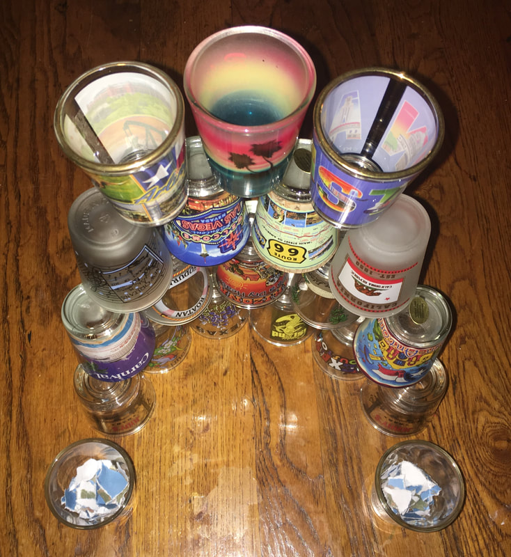
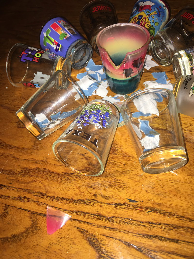
For project 1, we had to go to three locations and make sculptures out of at least ten items found at each site. I used my bedroom and my craft room. Though I had four sets of items to choose from, I selected all three of my final images from one site study. I used these shot glasses because they are very special to me and I feel as though they each hold different memories that I cherish. I filled two empty shot glasses with torn pieces of a map to symbolize the shot glasses I never got, the shot glasses that make my collection incomplete.
Image 1: I chose this image because I feel tension when I look at it, just like I felt when I was building the sculpture. As I stacked the fragile shot glasses, my heart raced and I was worried they'd fall and break.
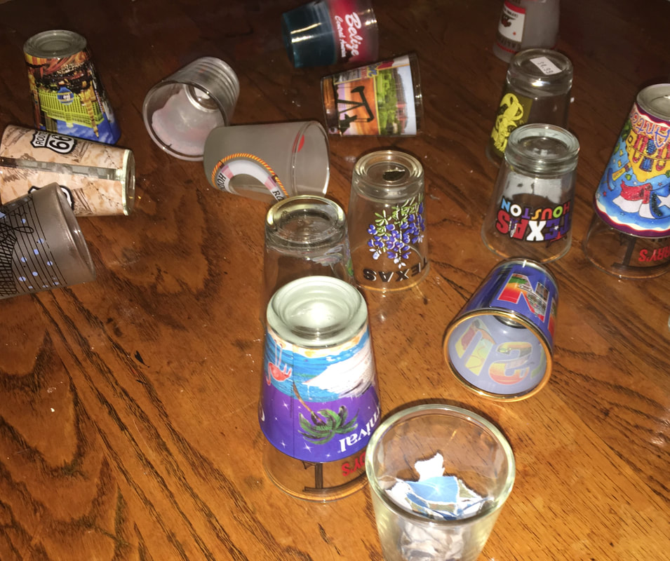
Image 2: I was right to be worried about them falling. I took this picture after my shot glasses fell and before I realized one had broken. I chose this image because I like that the arrangement of the shot glasses is natural and not just placed to look like it fell.
Image 3: This is one of my favourite images from this project. I chose this piece because the emotion I felt when my favourite shot glass broke is connected with the piece itself. It's the most metaphorical piece of the series because I was able to draw inspiration from the experience of my shot glass breaking.
You know what they say, art is pain.
Image 1: I chose this image because I feel tension when I look at it, just like I felt when I was building the sculpture. As I stacked the fragile shot glasses, my heart raced and I was worried they'd fall and break.
Image 2: I was right to be worried about them falling. I took this picture after my shot glasses fell and before I realized one had broken. I chose this image because I like that the arrangement of the shot glasses is natural and not just placed to look like it fell.
Image 3: This is one of my favourite images from this project. I chose this piece because the emotion I felt when my favourite shot glass broke is connected with the piece itself. It's the most metaphorical piece of the series because I was able to draw inspiration from the experience of my shot glass breaking.
You know what they say, art is pain.
