|
Throughout the semester, Clarissa seems to stay interested in environmental content within her work and has specifically been dealing with the issue of water. During the first critique, she was using objects found on the beach to create her small sculptures and prints. She was using some maps in her small works, but now she has begun to use larger maps. She uses a much larger scale and is using map imagery more than what she was doing before. For instance, she has overlays large maps on top of each other, but some are flipped and moved around. She wants us to realize we are sharing this space, even if we are not even in the same place. She hopes to continue working with environmental issues in her artwork.
Another art event I went to this semester was the My Medium show that was put on by the Student Art Association. The pictures above are of me with the three pieces I entered in the show. The event was on April 27th, 2018 at the Islander Art Gallery. There were a lot of people there because the show consisted of work made by students at TAMU-CC. A lot of people I talk to in class had pieces in the show as well, I think it was a really cool opportunity to be able to show off the work we have done recently. There were prizes for the juror's favourite pieces along with some honourable mentions. The artwork there was very diverse because there wasn't a theme and the piece were done by so many different artists.
Eduardo Kac was born in 1962 in Rio de Janeiro, Brazil and is now a professor of Art and technology Studies at the School of the Art Institute of Chicago. In 2002, Kac received the Creatice Capital Award in the discipline of Emerging Fields. He is considered a pioneer in many fields. Eduardo Kac’s “biotopes” are so unique and hard to categorize, the artist himself doesn’t know what to call it. His art requires a new art vocabulary, new cultural principles, and new criteria of artistic method. In To Life, a biotope is defined as “a uniform environment occupied by a specific community of plants and animals.” Aquariums and rooftop gardens are constructed biotopes. Kac’s biotopes are small habitats populated with microorganisms that cannot be seen with the naked eye. He keeps these biotopes in shallow, transparent 19” by 23” rectangular boxes. Eduardo Kac allows three different types of interactions to happen within his biotopes. The first: organisms respond to the environment’s temperature, humidity, airflow, light levels, etc. Second: the organisms relate to each other by competing for food and space as well as dealing with the ongoing production of waste. Lastly: they interact with people feeding, installing, transporting, and viewing the artwork. Biotope conditions are altered by this last interaction by generation of warmth, shadows, and humidity, and by releasing more populations of microorganisms when they breathe, sneeze, or cough. Kac uses these microorganisms as a medium to paint, rather than a traditional medium such as acrylic, oil, or watercolour paints. The organisms create compositions naturally and become pigmented over time. They gradually contribute their own shape, texture, colour, and pattern. Kac considers his biotopes to be new entities that are a new piece of artwork and a new living being all at once. “By incorporating microbial life cycles into art, Kac materializes the dynamic instability and multidirectionality that are currently infiltrating intellectual discourse, reformulating human expectation, and redefining lived experiences. My favourite piece of his is “Doohickey” from his series of biotopes called “Specimen of Secrecy about Marvelous Discoveries.” I am drawn to this piece mainly because of the geometric shapes, the balance of elements, and the colours. Blue and Orange is my favourite colour combination and those are two of the colours in this piece. I love abstract art and “Doohickey” caught my eye the moment I saw it on his website and even when looking at his other pieces, I always found myself looking back at this one. I utilize texture in a lot of my paintings and I adore the texture these microorganisms made within this painting. 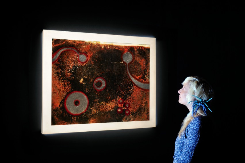 "Doohickey" Eduardo Kac Tavares Strachan was born in Nassau, the capital city of the Bahamas in 1979 and now works both in his home city and in New York City. He started as a painter, earning his Associate of Fine Arts at the College of the Bahamas in 1999. In 2003 he earned his Bachelor of Fine Arts from the Rhode Island School of Design and in 2006 he earned his Master of Fine Arts in sculpture from Yale University. My favourite work of art is a good example of Strachan’s goal with his art. “The Distance Between What We Have and What We Want” is a two and a half ton piece of ice taken from a frozen river in the Arctic. He transported this block of arctic ice to his home in the Bahamas. Before the ice was taken there, Strachan utilized the storytelling he experienced when growing up in the same area and the same school. He told the children of his adventure and how the sun was used to keep the ice frozen. This seemed impossible to them, like the myths he remembers from his own childhood. He even reenacted his adventures for this kids. He spoke to the children about global warming and the changes they and the Earth may experience during their lifetime. When the ice showed up, it gave the children hope in many ways. They saw that the sun was “a powerful ally” in endeavors that it actually caused. They were also shown that humans can come up with ingenious ways to battle these problems. They were also given hope because someone from their own home was able to complete such a great deed. He added a flag commemorating Matthew Henson, an African American explorer who was part of the team that discovered the North Pole, which was another message of hope for the children. When the ice was moved to Miami Beach, he traded that flag for two more flags. One was from Mount McKinley, known for its ferocious winds and ice-clad peaks that register below-zero temperatures. This flag had a fan that made it flap fiercely. The second flag represented the Bahamas, which has warm waters and lush foliage. The fan that effected this flag caused it to rustle gently. The fans and flags added even more contrast to his piece, embodying the interconnectedness of a globe where melting polar ice caps effect tropical islands thousands of miles away by raising ocean waters. This piece shows us how we depend on “hyperextended” means to deal with the effects of global warming that we as a species caused and now have to try to fix. “The ice chunk is, simultaneously, a wonder of nature, a strange anomaly, a holy relic, an alarming warning, and a pitiful refugee.” 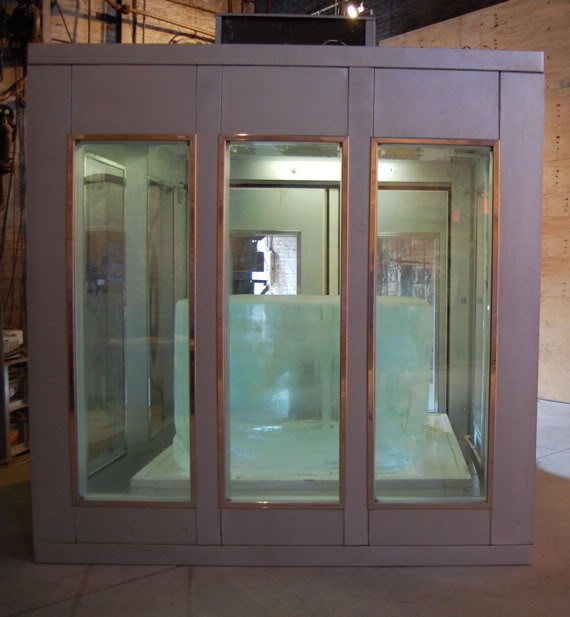 If I were to design a sculpture inspired by Eduardo Kac, I would build a box large enough to hold and grow plants. I would get seeds of various flowers, succulents, and cacti and I would mix them together and plant them randomly in the box. The plants would hopefully grow to create various patterns and colour combinations and interesting compositions within the box. Since it would be a living sculpture, some plants would die sooner than the others and some may even be seasonal. I think this would be an interesting living piece of art and the spontaneity of planting the seeds would also coincide with my own artwork. Creating a sculpture or project inspired by Tavares Strachan is more difficult because it deals with such a heavy subject matter and major contrasting elements. One idea I had for a project would be to create bird nests or bird houses from trash found in the environment, like at the beach or in a park. Birds already make their nests from trash in big cities and I think that's really cool. It would be taking something discarded that would usually destroy the world and creating something like a home out of it that actually benefits wildlife. This isn't even just an idea for bird houses, certain types of trash might be used to make shelters for other stray animals as well. This would utilize the idea of benefitting nature with something we as a species are ruining it with: litter.
For my first art event, I went to see Leticia's show Edge Friction at K Space Contemporary on March 2nd, 2018 during the Art Walk downtown. All of her sculptures were made of CDs, some were the full CD and some were broken in certain places either to fit the frames or because that's what she used to make certain shapes. For example, she had a few pieces that were rectangular and the CDs on the edge were cut to create that straight edge. Unfortunately I didn't get a picture of these pieces although I really wish I had because they were great. Leticia's sculptures are very reminiscent of science fiction because of the colours and reflections the CDs create as well as the shapes she creates using them. Many of her pieces are tunnel-like and when looking inside, it seems like the viewer is looking into a portal or another dimension. The addition of the theremin adds to the sci-fi atmosphere of the gallery. There was music playing, so I couldn't always hear it but when I walked around the room I noticed I could hear it in certain places over the music and the tone would change even when a person walked by it. This show proved Leticia's diversity because she was able to make so many unique sculptures using one medium. I brought three friends to the opening with me and all of them loved it. One of them even said she felt like she was in a gallery in New York.
I continued my work on my 100 objects project. I have the paper plates with food drawn on them in sharpie, but I added napkins over each one. On the napkins, I wrote the reasons each person chose their last meal in sharpie as well. I put the napkins over the drawings to make the installation piece more immersive. Since the drawing is hidden underneath, the viewer can walk up to the plates and lift the napkin to see food item the napkin was referring to. I had to collect and draw 22 more last meals and reasons because some people didn’t get back to me about their reason and I had to have those to complete the sculpture. For the third part of the sculpture, I changed the composition of my installation piece and added 4 more plates to make the concept more clear. I researched different methods of suicide and drew those methods on the paper plates with a napkin over them with the percentage of people who use that method annually. The four methods were by firearm, suffocation, poisoning, and other. I arranged them using the percentages of each method of suicide. For instance, about 51% of suicides annually are committed by firearm, so I arranged 51 plates around the plate with the gun. I think having the installation arranged in a more interesting way makes it more inviting to the viewer. Rather than just having 5 rows of 20, the shapes I made the plates in are now more fun to look at. Each group gets bigger from left to right. I wanted to make the viewer think about the issue of suicide because it’s something that effects so many people yet it’s so rarely talked about. By associating the last meals with people who committed suicide, I made the piece more emotional and less fun to go through. Now the viewer is seeing the meals as the last meal someone would eat before killing themselves. I think the concept for my piece is much stronger and more obvious now. A weakness in my piece is that I should have made the sculpture more inviting somehow. I would have liked it to be more obvious that the viewer is supposed to lift the napkins, so if I were to redo it I would have exposed part of the drawings on the plates so people would know to lift the napkins. I don’t think I would have changed much else because I really enjoy the way my installation turned out once I made the concept more clear and changed up the composition. I liked working on this piece, but I will definitely not be working with paper plates during the second half of the semester.
For the second part of my installation, I added 200 more items: napkins and reasons for the last meals. I kept the composition of my piece the same. Almost everyone got back to me with their reasons for their last meals, but 22 of them didn't so I had to draw 22 new items of food. I put the napkins on top of the drawings so the image could be revealed once the viewer lifted up the napkin. One weakness in my piece is the fact that not everyone knew if they could lift the napkins up or if they even should. I think the reasons behind the meals add more to my content because they let the viewer know that they are last meals. Some of the reasons may bring up the viewer's own memories and hopefully invite them to ponder what their last meal might be if they were to choose. For the next part of the installation, I hope to bring another aspect into it to make it feel more morbid and cause a different reaction, maybe even pose a different question for the viewer to think about.
I did the 100 objects project, but I technically picked two objects. I used 100 paper plates and I collected 100 last meals. I asked people in the true crime community what they would choose as their last meal. Initially, I wanted to draw everything they told me but that started to seem unreasonable, so I chose one thing each person mentioned. I drew 100 different meals on the paper plates with some sharpies. I tried to use very simple illustration with little texture. I lined the plates in 5 rows of 20 on the wall. I think the concept is interesting, but I do want to make it a little more obvious what exactly the food means. I’m hoping to make the “last meal” point more apparent for part 2 of the assignment and I already have a few ideas of how to do that. I’ve been complimented on the installation by a few people, so I can assume the execution of the project was successful, even though the concept may not have been completely understood. I’m not completely happy with all of the plates, so I hope to redraw a few of them, but when they’re all displayed together I don’t think it’s as noticeable. If I were to redo this project, I would probably add in some more disturbing aspects to make it more obvious that they’re last meals. I have also been wondering how colour would affect the installation. Going into part two of this assignment, I want to add in colour and change the way the plates are installed. My idea is to put the plates in a darker setting that makes the viewer wonder what the meals could mean and why it has a negative feeling. I’ve been thinking of hanging each plate from a noose or putting them behind a wall and having the viewer sit in a creepy chair to view the meals, similar to what an electric chair used for executions might look like. The second idea would definitely be harder to do, but I think it would be good for the concept of my piece. I want to colour the plates with markers and make the colour very simple. I have been thinking of just using lines to colour them rather than shading in each food item completely. I think using contour lines will help define the shapes of the food as well. I am really looking forward to working more on this project and making it more successful.
For the first graduate student critique, I attended Clarissa's. She is exploring the relationship between man and nature, specifically the environment around us. She collects items from the beach and creates small sculptures and monotypes using them. Her sculptures relate to what she has printed. She is selective with her colour and considers movement and shapes while she creates. Clarissa combines natural and unnatural objects. She doesn't necessarily make the sculptures to display together. Clarissa has been experimenting with her monotypes a lot this semester, including using maps of where she found some of her items. Her intervention while creating is different with every piece and is often based off of aesthetics. She is attracted to radial imagery, geometry, and symmetry and she pays attention to textures. When she is looking for items on the beach, Clarissa picks up things she finds interesting and objects that are bright and odd. She once picked up a toy car because it made her think of a memory that was left at the beach. She likes to work intuitively then reflect on what she has made. It is like an experiment set up in front of her about what she is inspired by and connected to. Clarissa is inspired by dark matter and artists such as Taylor Baldwin and Nicole Pietrantoni.
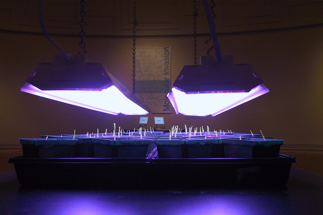 "Molecular Invasion" Critical Art Ensemble, 2002 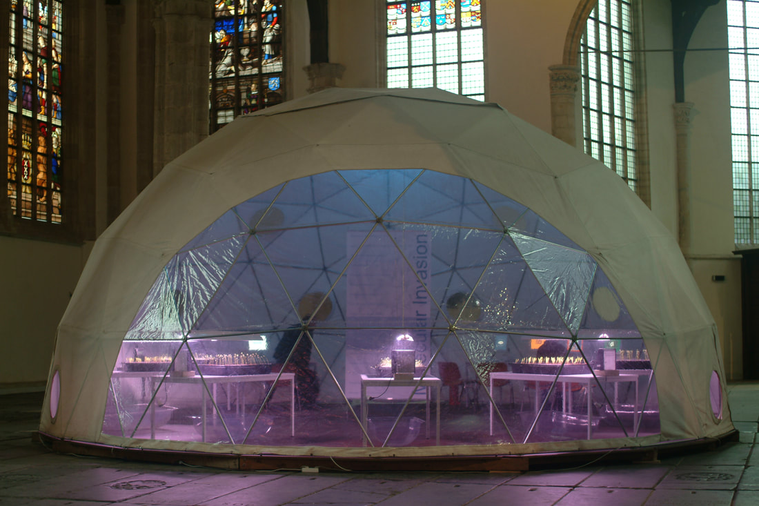 "Molecular Invasion" Critical Art Ensemble, 2002 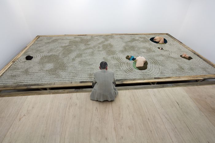 "Klunk Garden" Gelitin, 2009 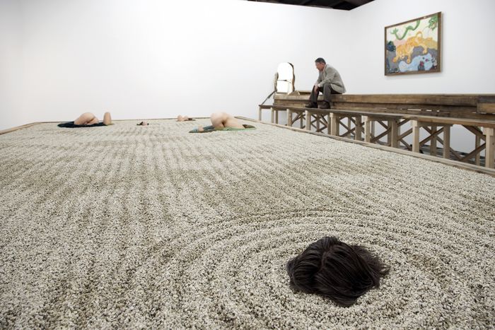 "Klunk Garden" Gelitin, 2009 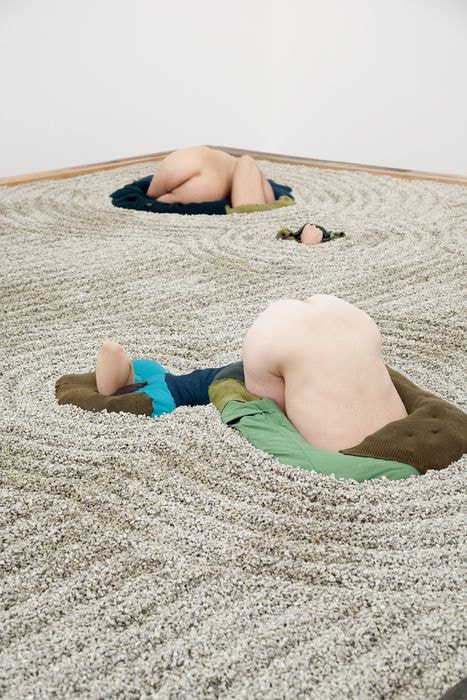 "Klunk Garden" Gelitin, 2009  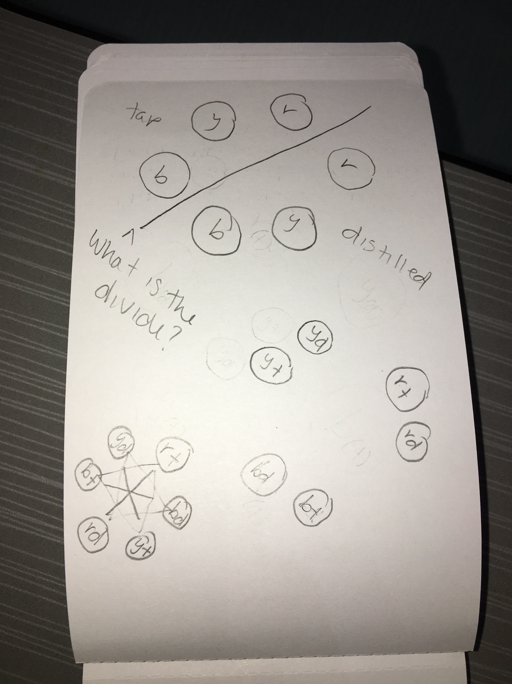 For our reading in To Life, the first artist I looked at that I was interested in is Critical Art Ensemble. CAE was founded in 1987 in Tallahassee, Florida. The ensemble consists of artists with backgrounds in various media like web design, film/video, photography, text art, book art, and performance. The reason I was drawn to them is because of their installation called Molecular Invasion in Washington DC in 2002. The group, along with several other artists and scientists, wanted to see if it was possible to reverse the effects of genetically modified seeds such as canola, corn, and soy. I liked this installation because it challenges the genetically modified seeds that the evil corporation Monsanto has been marketing around the world. Monsanto sells these seeds that can withstand the herbicide Roundup, which will kill all unwanted plants in the crop—so all of the plants that Monsanto didn’t manufacture. The problem is crops that aren’t genetically modified in surrounding farms are often exposed to the Round Up and they end up dying and if a Monsanto seed gets into their crop, they have to give the entire crop to Monsanto because they have a patent on the GMO seeds. I got carried away writing about the evil corporation, sorry, back to the art stuff. Critical Art Ensemble transformed the museum into a nursery to grow GMO plants and regular plants in the same environment. When the plants were grown, the artists applied a nontoxic chemical disrupter to the GMO crops. A few days later, they sprayed all of the plants with Roundup. All of the plants died, including the genetically modified ones, so the experiment proved to be successful. CAE proved that genetic manipulations can be overcome as well as showing the world that a group of artists had the capability to undermine the calculations of a huge corporation. CAE does not protest the system or condemn genetically modified crops, they protest the system in which GMO companies basically own and control the world’s food supply while making profits. CAE conducts experiments on food technology that is very new and hasn’t been tested long-term by the corporations that use them. They don’t believe in using harsh acts to prove a point because those would earn corporations sympathy, make the artists look bad, and have a negative effect on smaller farmers. They prefer to sabotage the corporations by emboldening the public to challenge corporate and scientific authorities. CAE uses 3 military attack principles in their sabotage. Focus attack on the weakest link in the system, form accurate targeting systems to avoid collateral damage, and use the minimum amount of force necessary to accomplish an objective. In regards to the first principle, CAE discovered that all information about patented products is placed in public domain, including GMOs. This means that information can be investigated by scientists and the public. The second principle took great thought, because they had a feeling Monsanto would try to shut them down. Monsanto actually sent lawyers to the exhibition and brought cease and desist letters, but the artists believed it was just a bluff. CAE used about $10 worth of seeds and they knew that if the corporation were to sue the artists, they would also have to sue the museum hosting the exhibition. Monsanto doesn’t have a good image in the public eye (for obvious reasons) so CAE knew they would avoid suing an art institution that was part of the Smithsonian. Regarding principle three, the artists learned that doing this experiment wouldn’t be as difficult as they thought and was actually relatively easy. They could purchase the vitamin needed to disrupt the chemical modification at any vitamin store. The whole process was both simple and safe. They could not purchase the GMO seeds because they were not licensed to use them, but they found out that sometimes bags of seeds break and they could find the seeds at the bottom of trash cans. CAE’s idea was to use the chemical process for political reasons and to start a network of biological hackers. They want the public to realize they are capable of undermining corporations that seem immune to scrutiny. Their website has accessible models that the public can look at to learn more about genetically modified plants so they can evaluate the risks of using them. CAE considers Molecular Invasion to be a demonstration. One of the leading artists in CAE was arrested on suspicion of bioterrorism and everything regarding his research, along with his wife’s body and his cat, was taken from his home even though his biological materials were harmless.
The second artist I chose to read about was the Austrian group Gelitin that was formed in 1993. I liked this group because they have uplifting messages but express those messages with raunchy humour. The artists parody the idea of enlightenment and oneness. One piece of theirs I really liked is “Klunk Garden.” This is a zen garden they installed in Tokyo that does not look like it was meant to enlighten anyone. Zen gardens are used as a way of meditating and people who actually practice Zen spend decades on the process. Viewers walk up stairs to an elevated bridge above the Zen garden. The artists replicated an actual Zen garden with accuracy and retains the garden’s traditional purpose. The only difference was the use of their own bodies instead of stones. There were holes cut into the Zen garden to fit the shapes of certain rock-like parts of their bodies, the main (and most shocking) body part being the butt. The artists hoped to shift human consciousness from “being outside of nature” to “being in nature.” This is one aspect of Gelitin that I really loved. They hoped to expand awareness using parody and humour, which I think is a smart way to get people talking and thinking. The artists achieve a flip-side of “oneness” by using expressive artwork. They have an environmental goal: to assert the role of human attitudes in setting our planet’s course. For my mini-installation I want to put 3 different coloured Grow Monsters in 6 tubes. Each colour would be separated into 2 tubes and I would put the same amount of Grow Monsters in each. The installation would be symmetrical with one difference: 3 tubes would be grown with tap water and 3 would be grown with distilled water. While researching Grow Monsters, I learned that in tap water they can grow up to 500% their original size and when they’re in distilled water they can grow up to 10x more than in tap water. The concept for this installation can be both environmental and social. It can show how different environments can effect the outcome of growth, whether it be growth of plants or even the growth of children. When researching I kept thinking of the Grow Monsters as a kind of metaphor for children and the fact that they’re child’s toys is good for that concept. I’m not yet sure how I would set up the installation, but I guess that’s what the mini-installation is for. |
AuthorWrite something about yourself. No need to be fancy, just an overview. Archives
May 2018
Categories |
 RSS Feed
